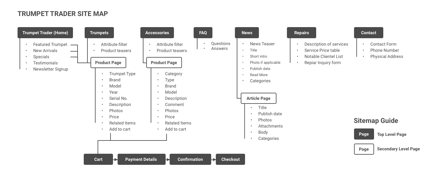
Site Map
Re-architecting the sites content structure was needed. The original organization made things a little more cumbersome then they needed to be.
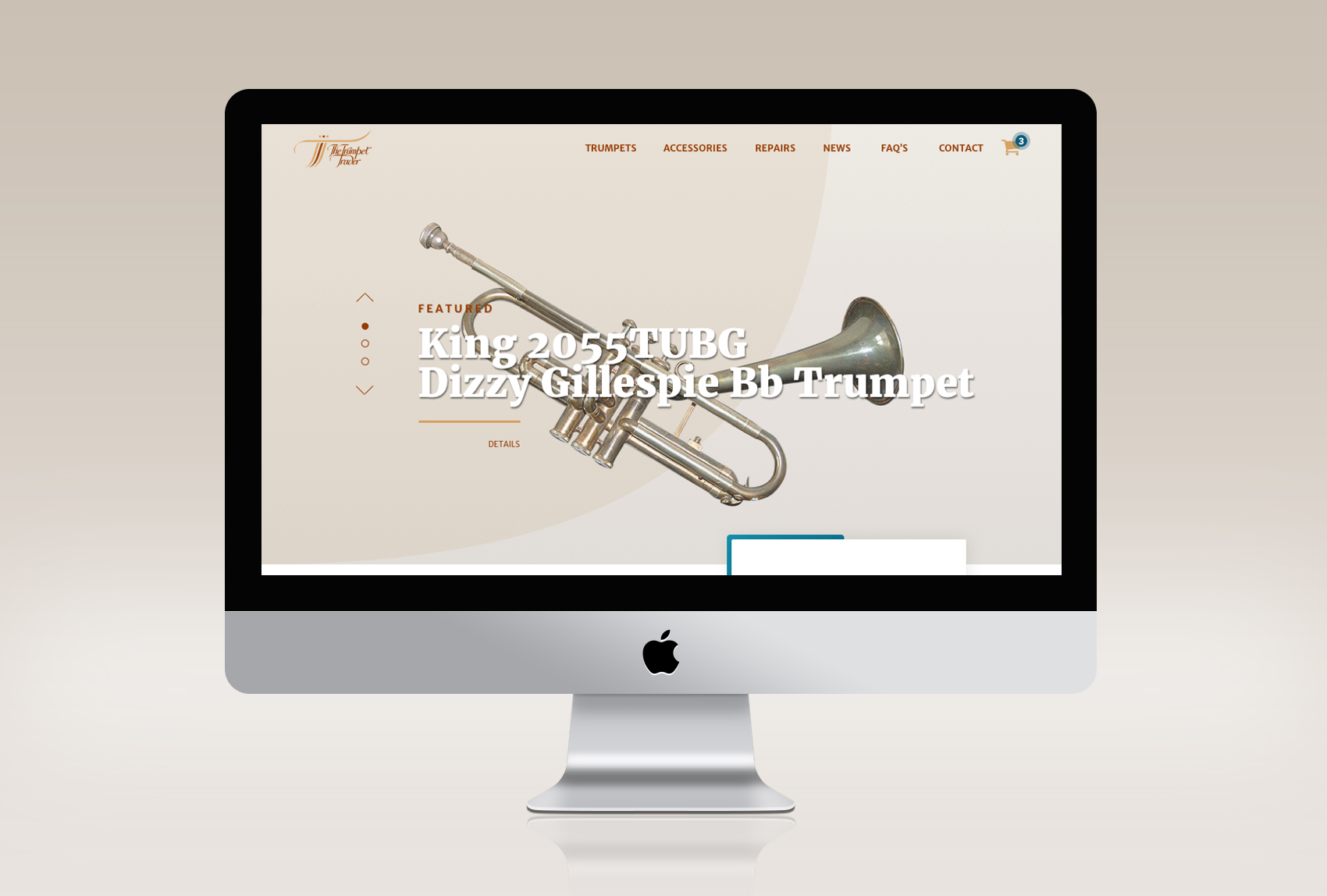
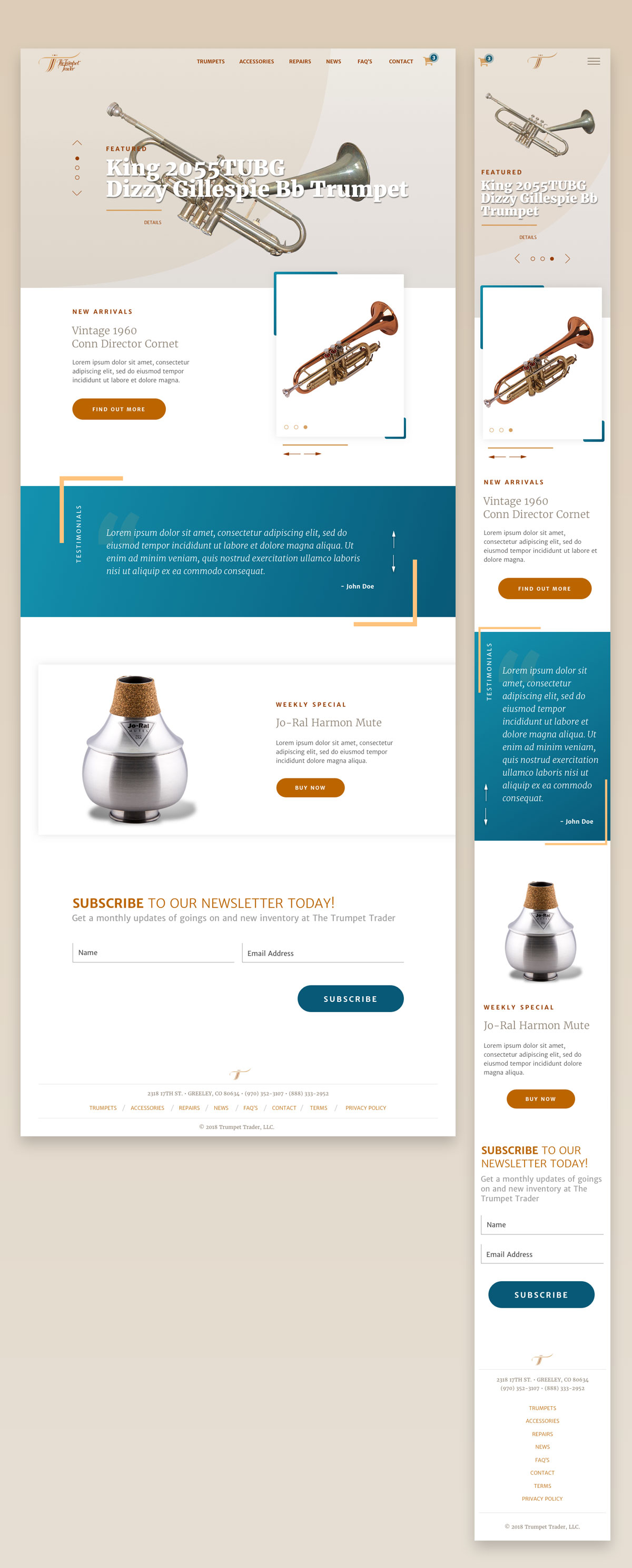
Home page
The home page needed a major revamp. Since the site launched it has been a splash page with an “Enter” link. That was sort of in tune with trend when it launched but shortly proved ineffective as an entry point. The page was restructured to provide an opportunity to highlight trumpets in several different ways.
- A Featured instrument section that could display several horns.
- New Arrivals. A place to call out anything new to the store.
- Testimonials can be very important when it comes to selling instruments.
- Specials. Anything on special can be highlighted.
- A newsletter sign to keep visitors informed on what’s new in the store.
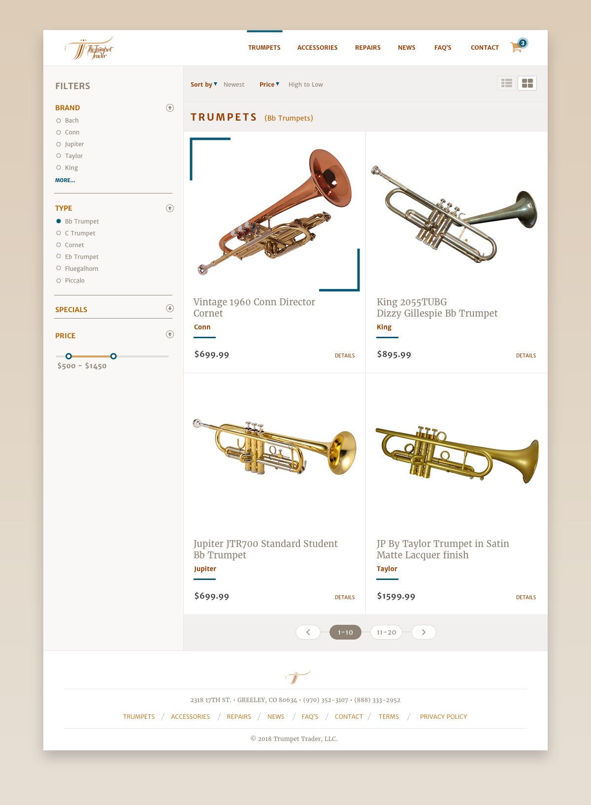
Product List Page
On the current site, the product list page is nothing more than several tables that display the content and provide a place for an image or two. Even though the instruments were grouped it doesn’t provide the visitor with a lot of control to refine exactly what they are looking for. It is vital to add a faceted filter. This will provide visitors with more control and quicker viewing of a desired product, possibly increasing sales.
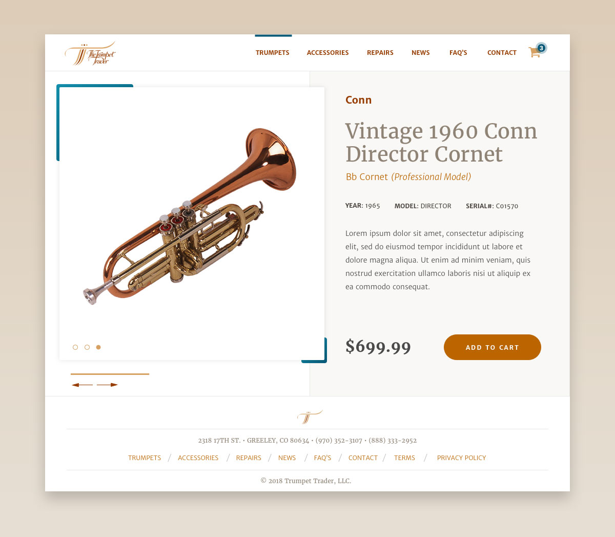
Product Page
Finally having a product page provides the ability to display the instruments in the best light. Providing all pertinent information about the trumpet as well as having several images. Something again the existing site does not have.